JRF REMIT
Transforming Jpremit Through User-Centered Redesign
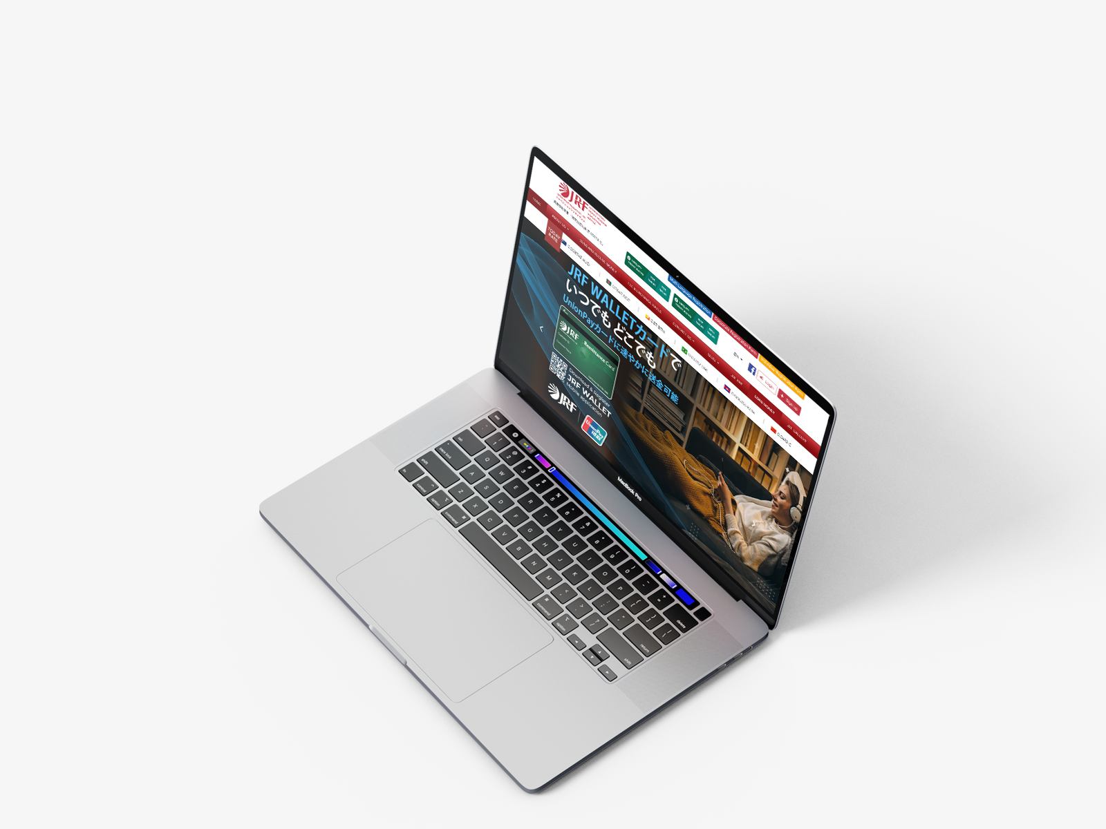
A responsive website redesign focused on simplifying remittance, improving usability, and creating a modern multilingual experience across all devices.
JRF REMIT
A responsive website redesign focused on simplifying remittance, improving usability, and creating a modern multilingual experience across all devices.
THE PROBLEM
BACKGROUND
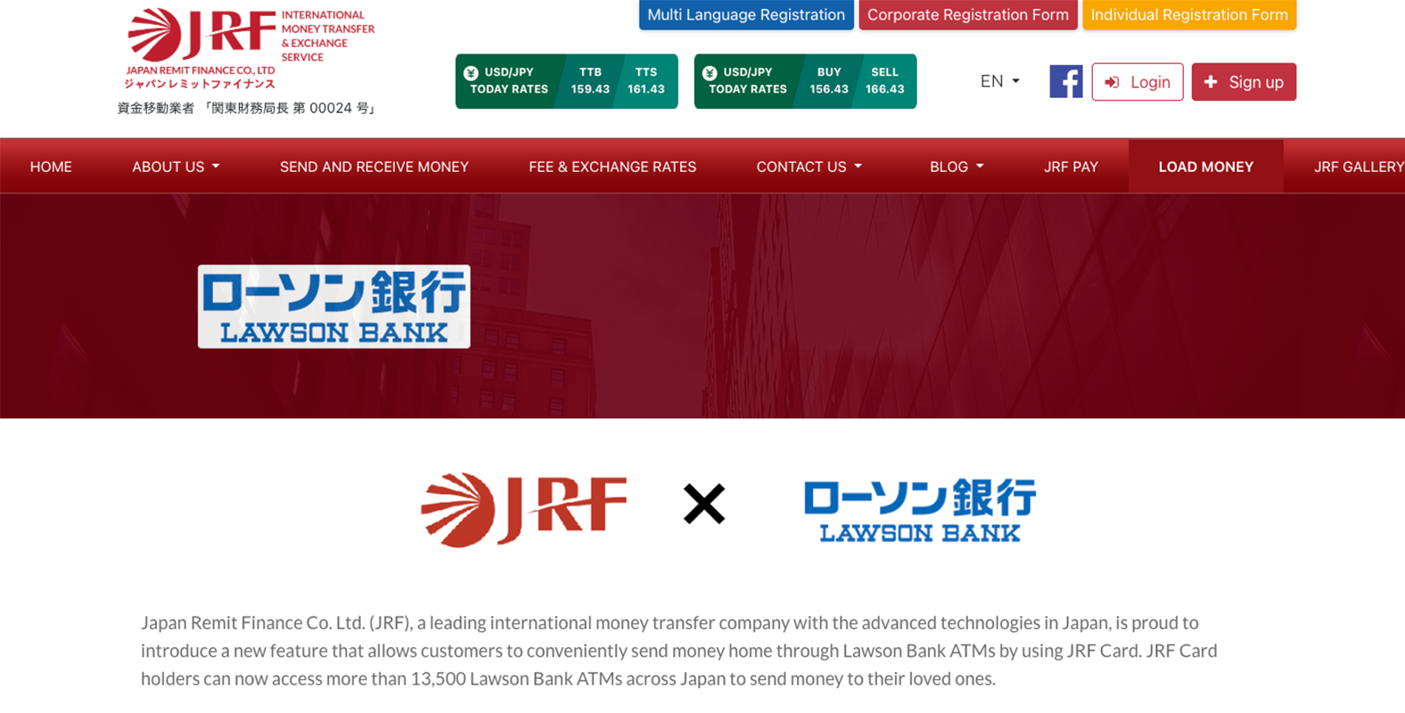
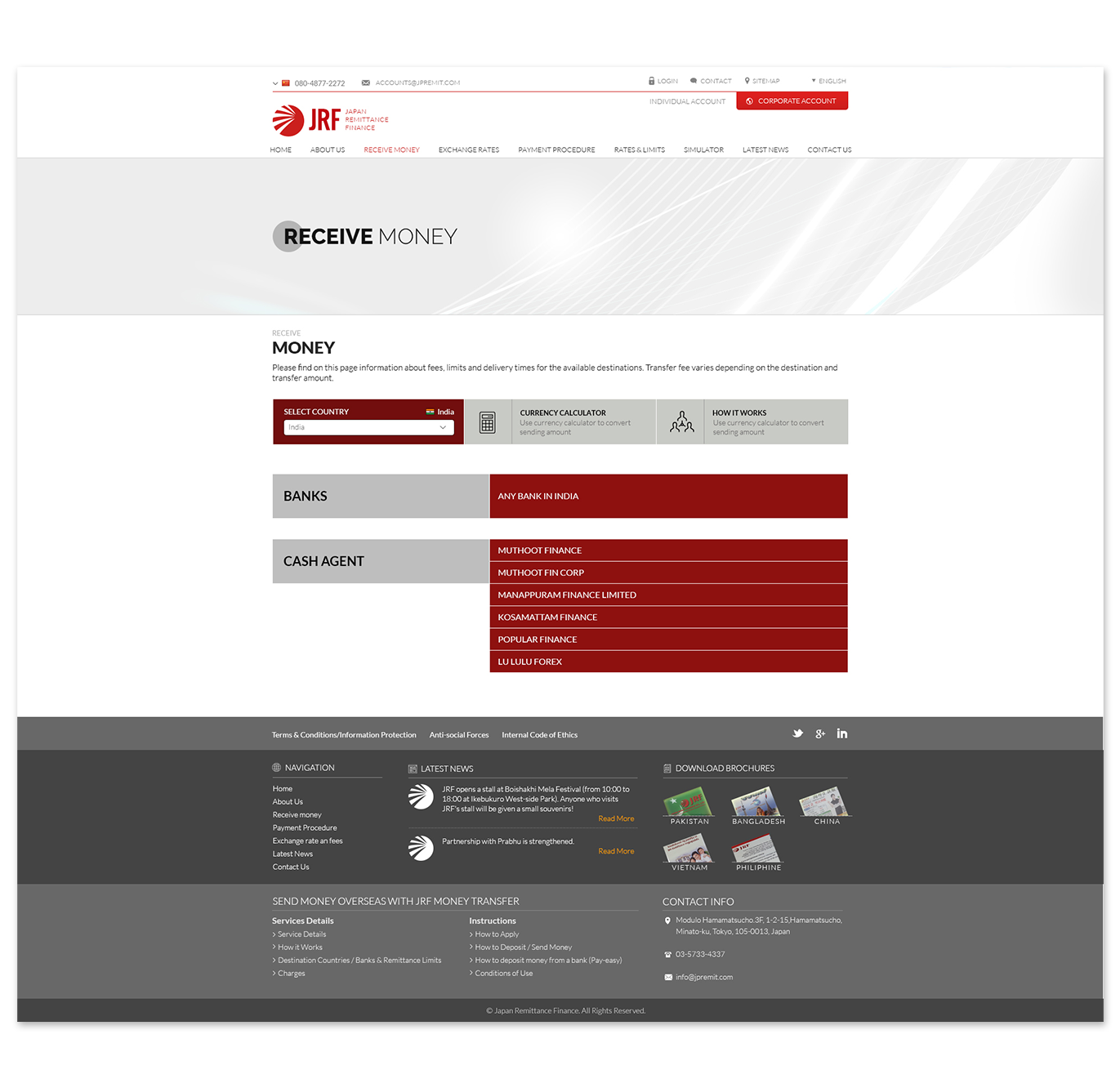
Although Jpremit offered a wide range of remittance services, the website experience was not meeting customer expectations. Users reported difficulties with registration, cluttered layouts, inconsI seistent user journeys, and limited access to remittance calculation tools. Through customer feedback and business discussions, I discovered the need to simplify navigation, improve visual hierarchy, and make key information such as exchange rates, service fees, and JRF services more accessible. This led to a complete responsive redesign focused on usability, trust, and conversion.
The Psychology of Coffee and the Café Experience, Journal of Consumer Research, 2022
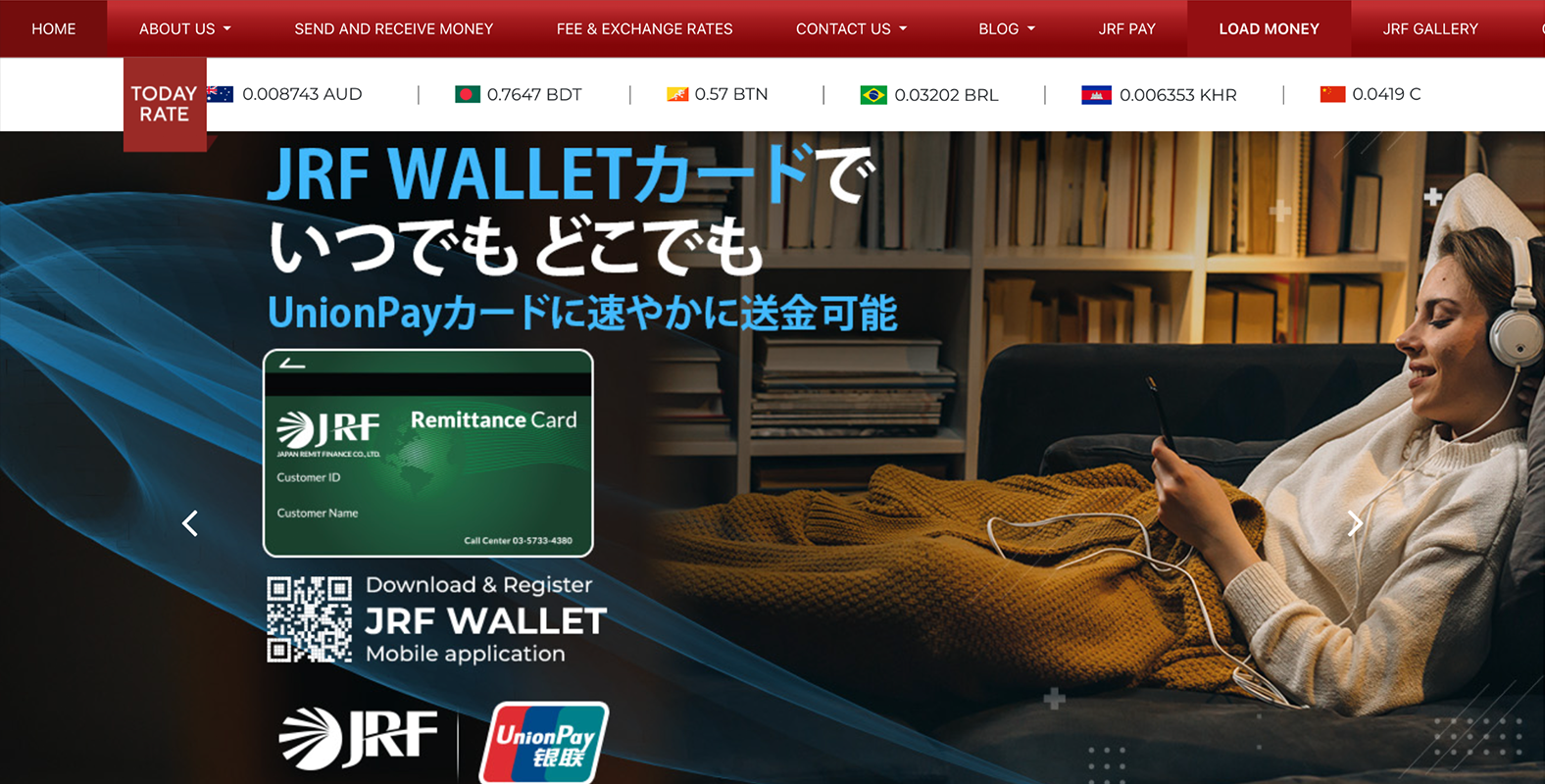
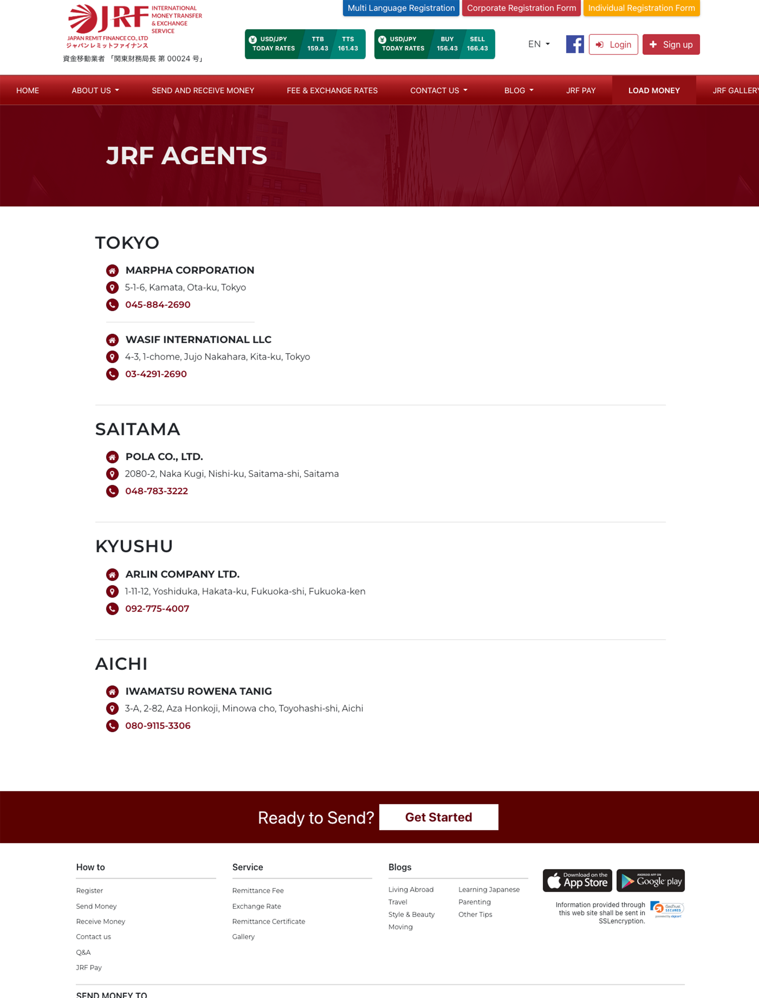
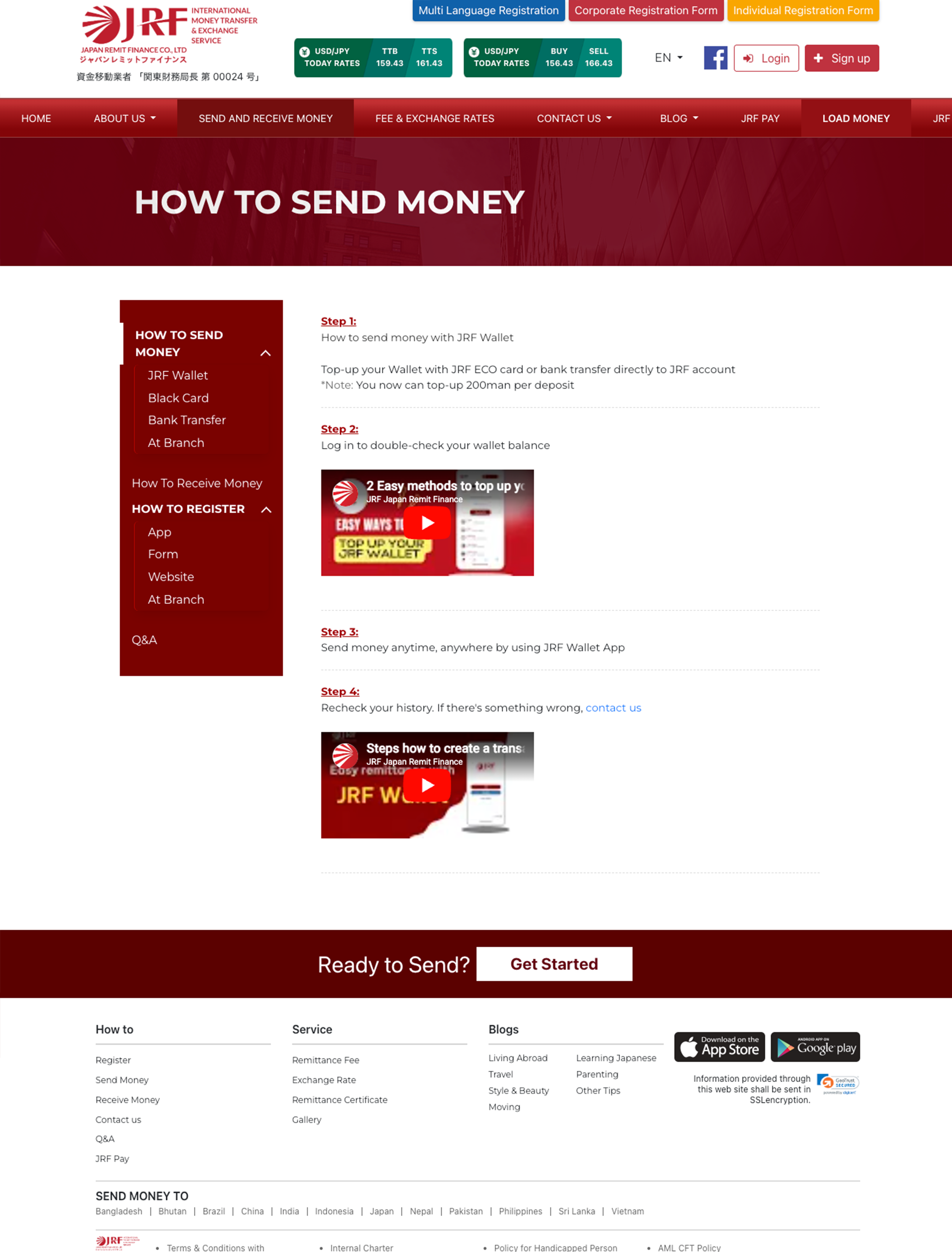
I redesigned Jpremit to create a cleaner, more intuitive, and fully responsive remittance experience. The focus was on simplifying registration, improving access to exchange rates and remittance tools, and making essential services easier to discover across all devices.
RESEARCH
To better understand the customer journey, I conducted an audit of the existing Jpremit website and reviewed customer feedback. This helped identify usability gaps and opportunities to improve the overall remittance experience.
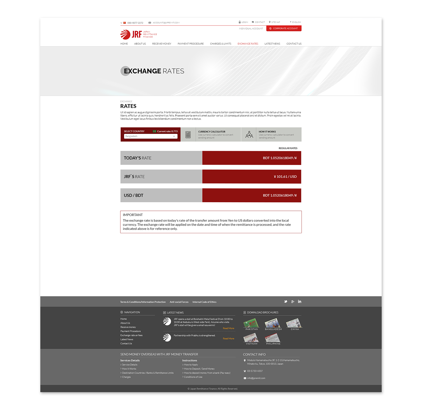
Visual Experience: The interface felt cluttered and lacked a consistent visual identity, making important information difficult to prioritize.
Navigation & Accessibility: Registration flows were difficult to follow, and customers struggled to quickly access exchange rates, calculators, services, and key website sections.
Functionality & Engagement: Customers requested better remittance calculation tools, multilingual accessibility, improved service visibility, and stronger trust signals throughout the experience.
The current website falls short with brand alignment, navigation, and functionality, leading to a frustrating user experience.
With a clearer understanding of the existing experience, I gathered customer feedback, reviewed business requirements, and analyzed competitor platforms. As this project directly impacted customer onboarding and remittance journeys, it was important to balance business objectives with customer expectations.
Discussions with stakeholders highlighted priorities to simplify registration, improve website responsiveness, increase visibility of exchange rates and remittance tools, promote JRF services, strengthen trust through testimonials and partner presence, and create a multilingual experience that supports customers across different regions.
I collaborated with business stakeholders to understand priorities, customer concerns, and strategic goals for Jpremit. These discussions helped ensure the redesign balanced business objectives with a simpler, more accessible, and customer-focused remittance experience.
Business & Product Stakeholders
Usability:: Simplify registration and navigation to reduce customer confusion and improve completion rates.
Visibility:: Display exchange rates (TTS/TTB), remittance tools, and key services prominently for faster decision-making.
Growth & Engagement:: Strengthen the JRF ecosystem by promoting JRF Wallet, cards, multilingual accessibility, social channels, and trust-building elements across the website.
Through interviews with existing and potential remittance customers, I explored their behaviours, expectations, and frustrations across registration, remittance, and website navigation. I then synthesized the findings using an affinity mapping approach to identify recurring themes and uncover opportunities to improve the overall customer experience.
I analyzed four local and industry-leading coffee shops, identifying strengths, weaknesses, and opportunities for design inspiration.


DEFINE
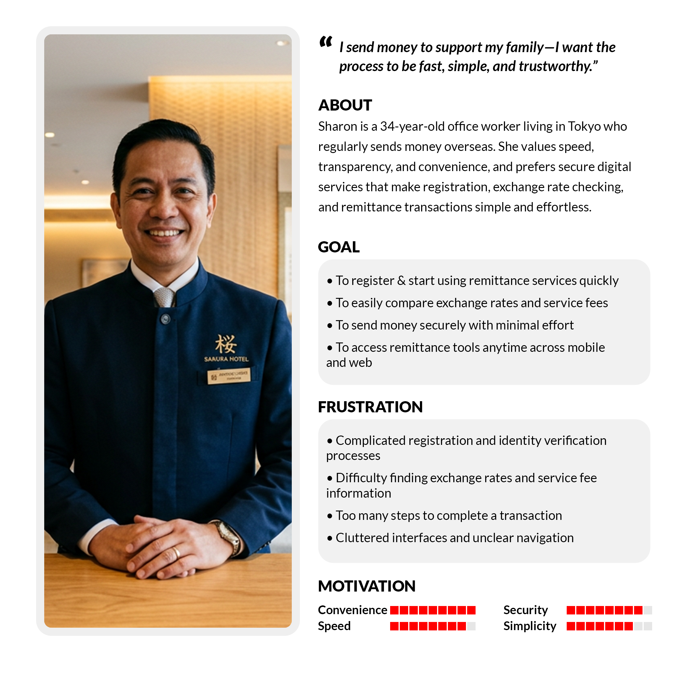
To transform research insights into actionable design decisions, I created a user persona that represented the goals, behaviours, and challenges of target customers. This helped guide design choices and ensured the experience remained focused on real customer needs.
Sharon needs a remittance platform that is simple, trustworthy, and accessible, allowing her to register easily, calculate costs clearly, and send money to her family without delays.
HOW MIGHT WE…
IDEATION
Research revealed that stakeholders prioritized simplicity, visibility, and customer engagement, while customers wanted faster access to remittance tools, clearer registration flows, and easier access to essential information. Guided by these insights, the redesign focused on improving usability, simplifying navigation, and creating a seamless digital experience across all devices.
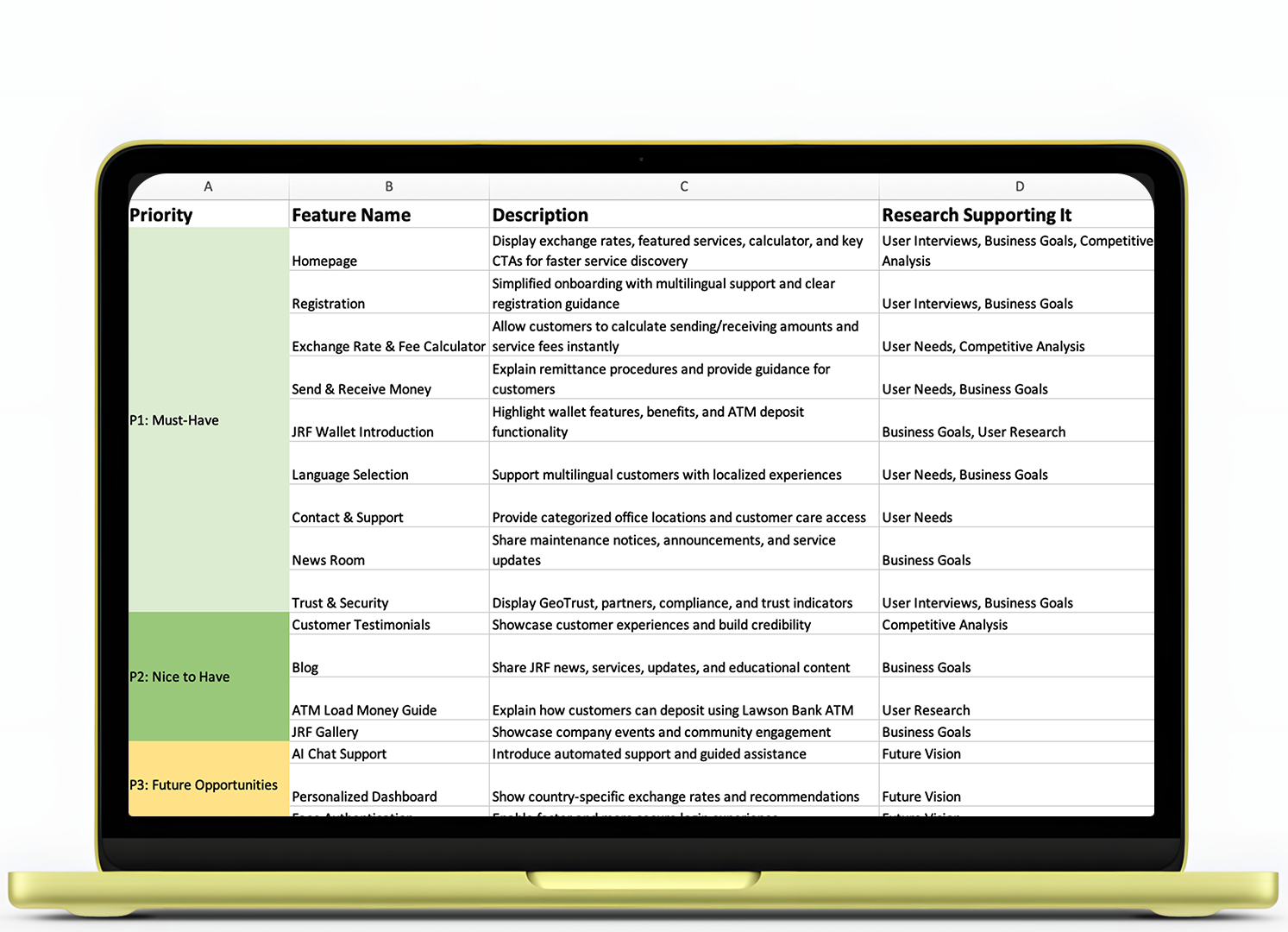
To prioritize the website experience and define the most valuable functionality, I created a feature roadmap based on business objectives, stakeholder input, and customer research. The following features were identified as key to improving usability, increasing engagement, and supporting the overall remittance journey:
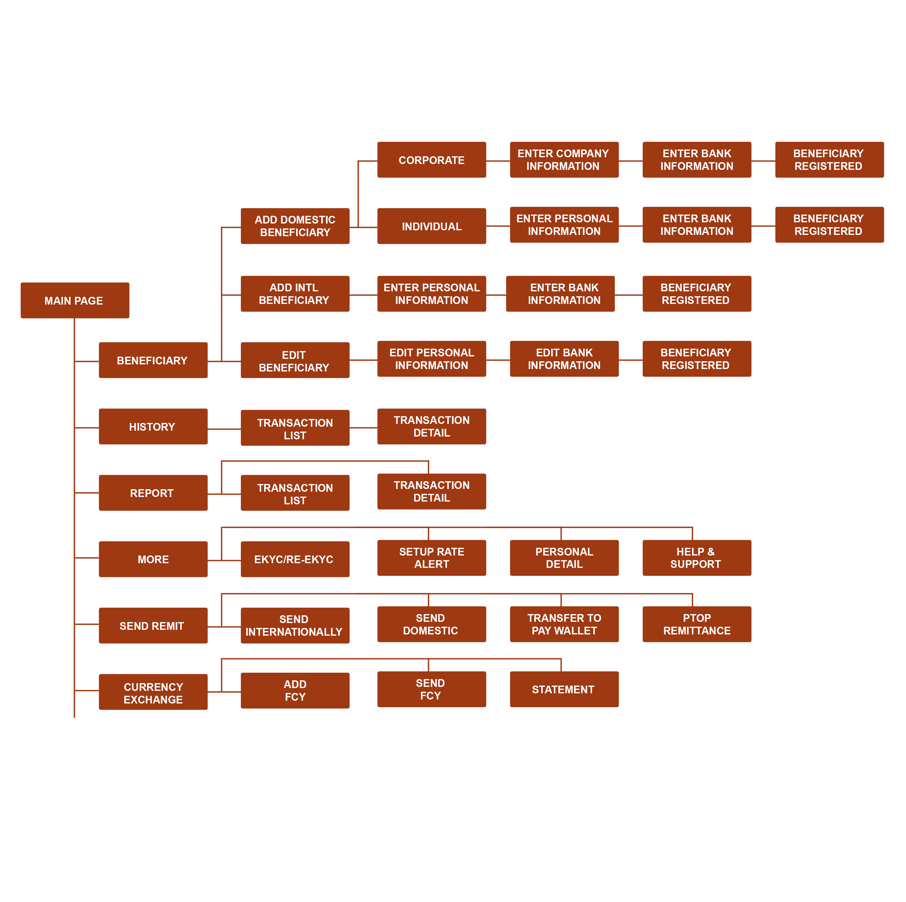
With the core features prioritized, I transformed them into a structured site map to create a clear and intuitive navigation experience. The information architecture was designed to improve discoverability, simplify access to remittance services, and ensure customers could quickly find key information across the website.
DESIGN
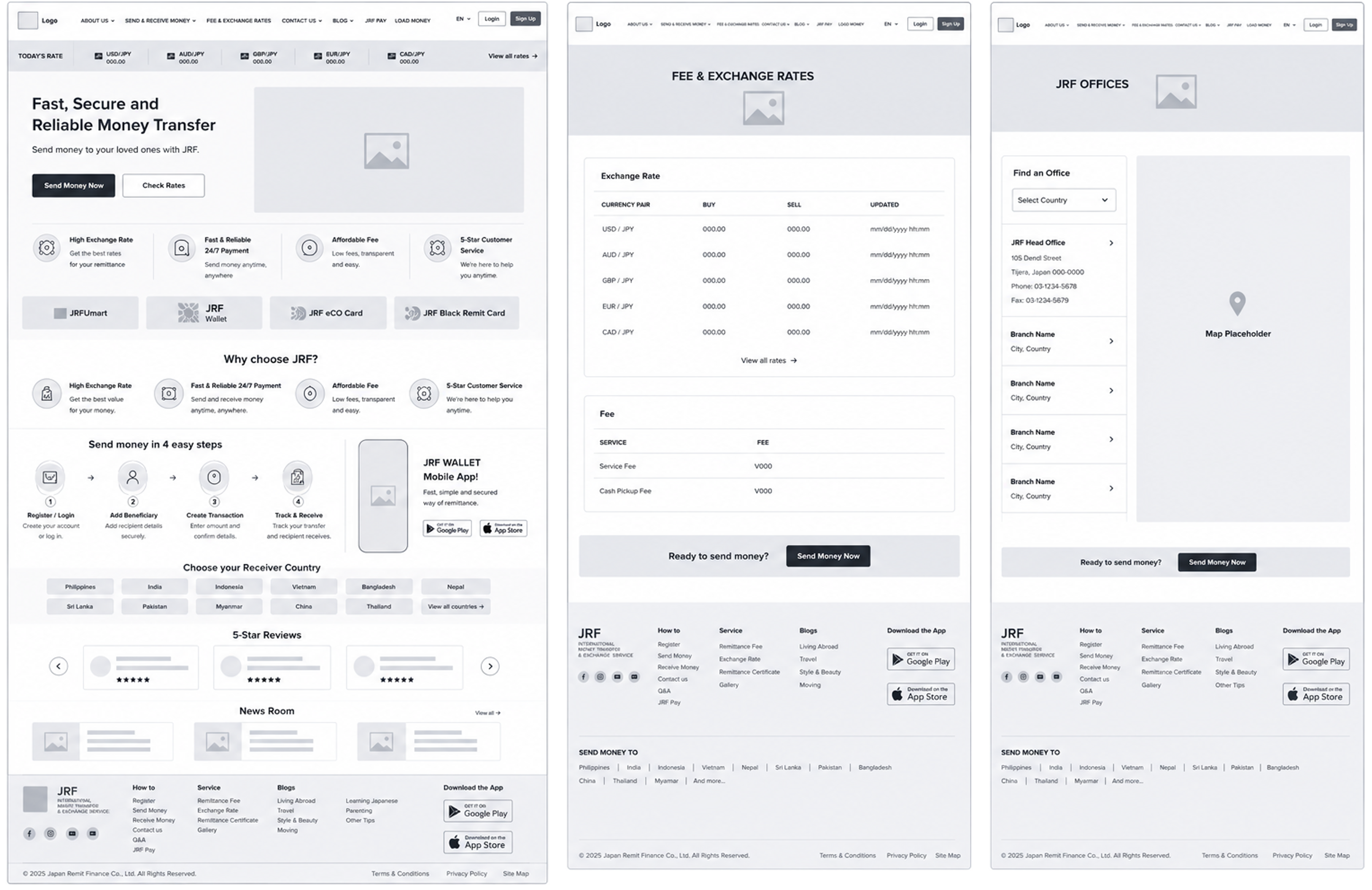
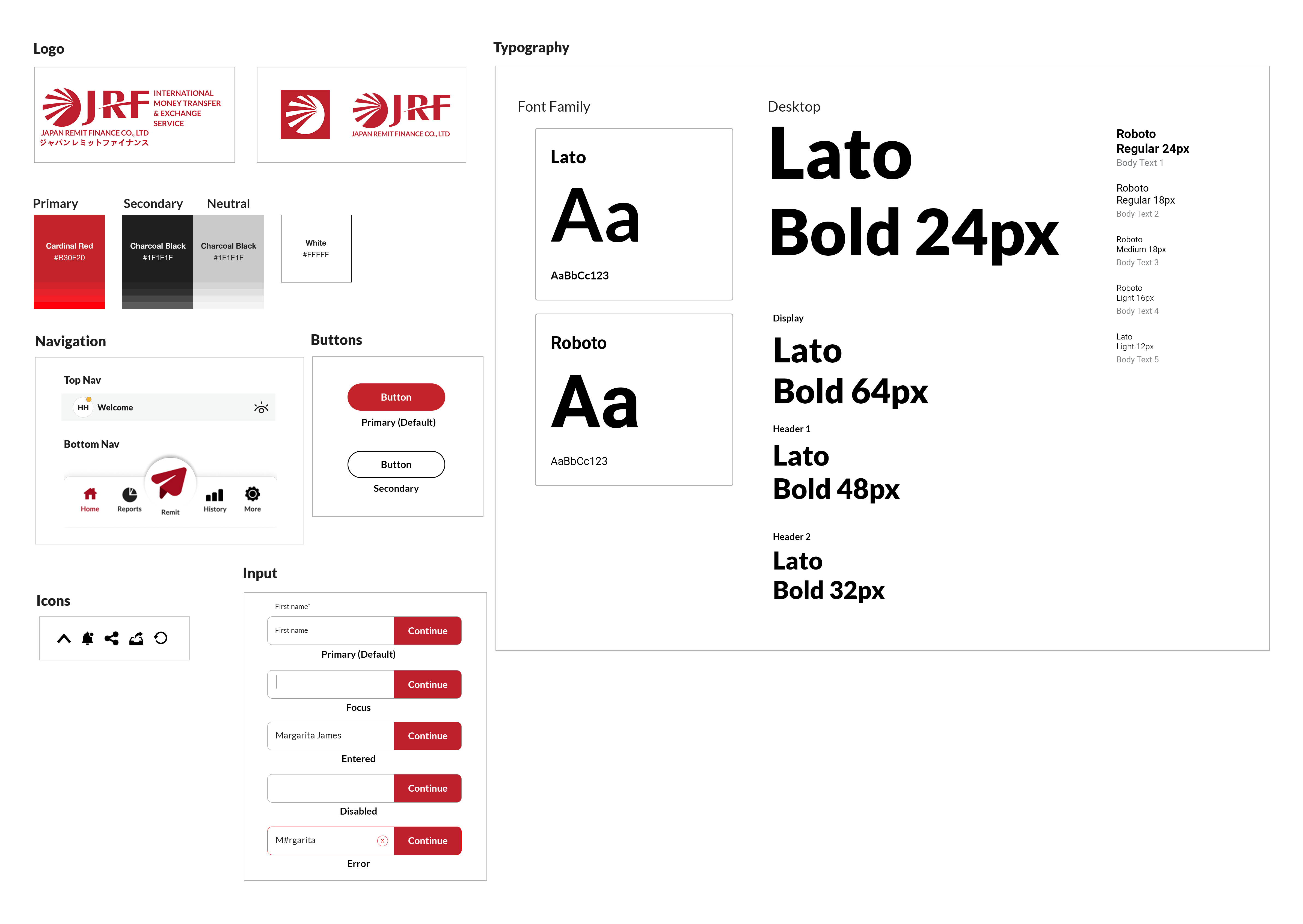
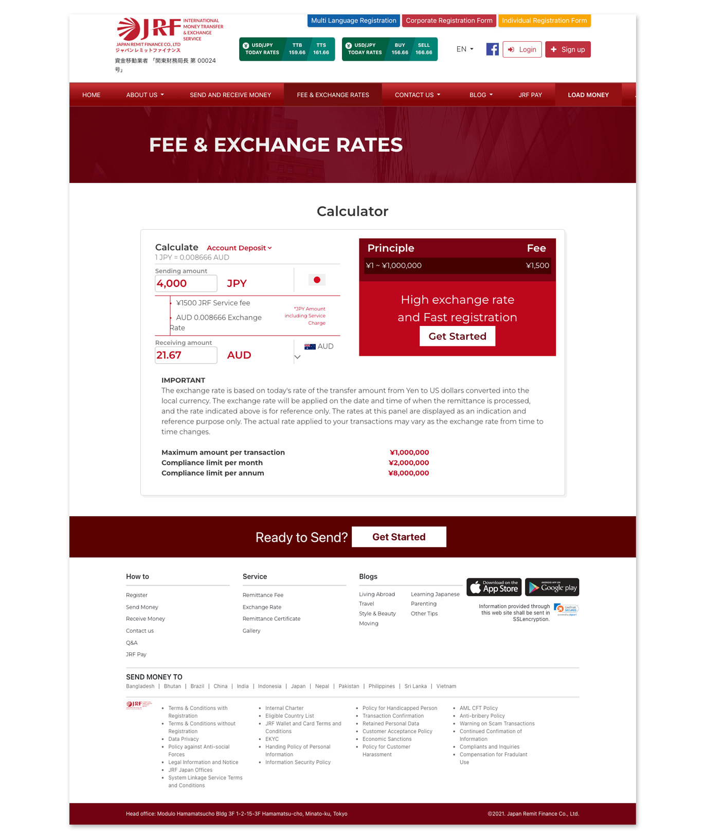
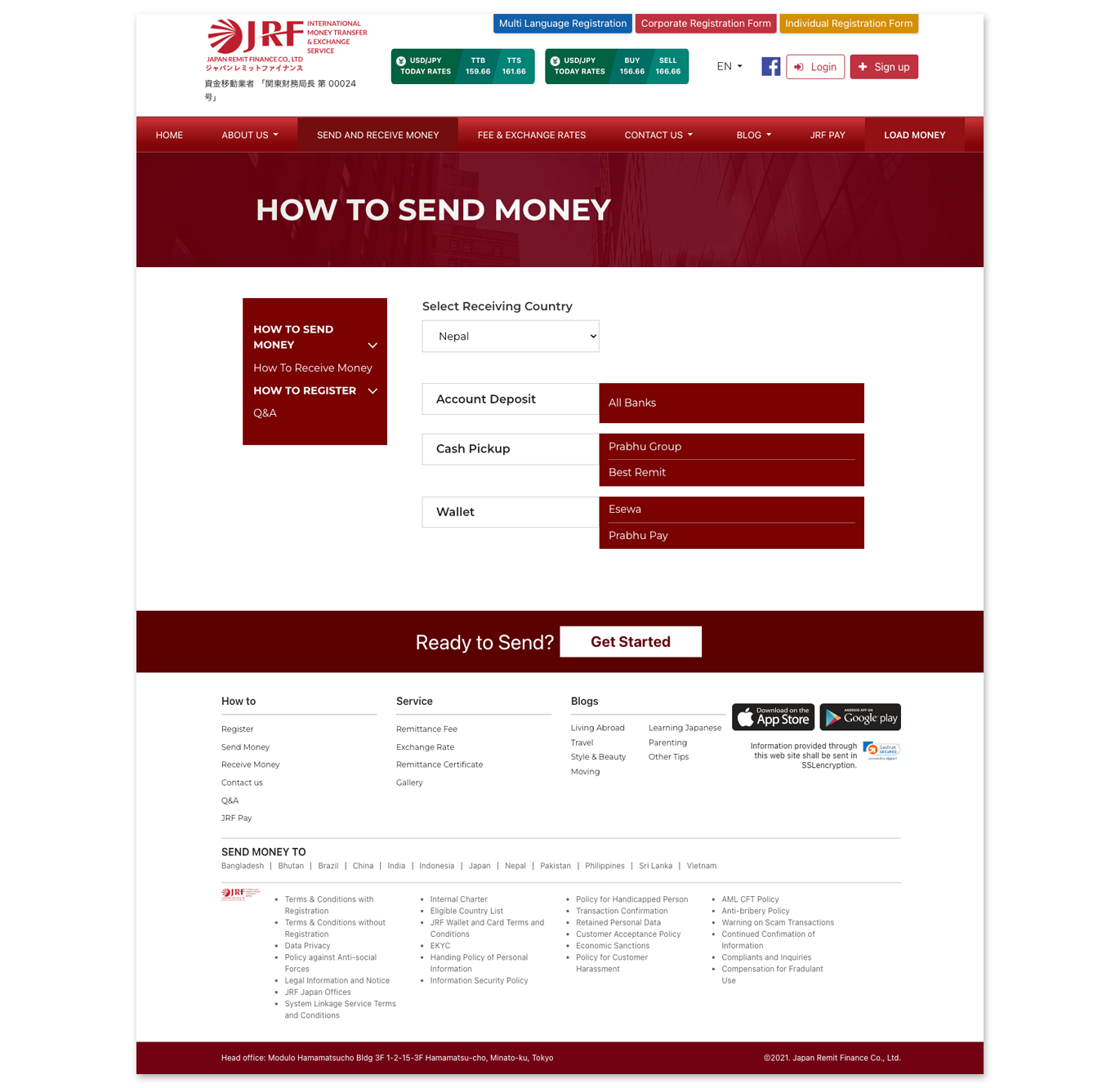
With the information architecture established, I translated ideas into wireframes and refined them into high-fidelity designs in Figma. The focus was on creating a responsive, intuitive, and visually consistent experience that improved discoverability and simplified access to remittance services.
One of the key challenges was balancing a large amount of content and business requirements while maintaining a clean and modern interface. I introduced a structured layout, a two-color system aligned with the JRF brand, and carefully prioritized information to improve usability across all devices.
To create a more engaging and accessible experience, I focused on:
Every design decision—from layout to visual styling—was made to simplify remittance, improve discoverability, and maintain a consistent brand experience across all devices.
TESTING & ITERATIONS
To validate the effectiveness of the redesign, I conducted moderated usability testing with participants to evaluate navigation, accessibility, and overall satisfaction across key remittance journeys. Participants were asked to:
Participants were successfully registered and created the transaction. They highlighted improvements in usability, information clarity, and easier access to remittance tools and services. The testing also revealed additional opportunities to further optimize the customer journey and engagement.
1
BEFORE
AFTER
2
BEFORE
AFTER
RESULTS
The redesigned experience achieved a satisfaction rating, with customers and stakeholders highlighting improvements in navigation, accessibility, and ease of completing remittance-related tasks. By creating a faster and more seamless journey, the redesign strengthened customer confidence, increased engagement, and reinforced Jpremit as a modern and accessible remittance platform.
Khan Ahtaram, Corridor Team Head
PROTOTYPE
FINAL THOUGHTS
Key Learnings:This project reinforced the importance of balancing customer needs with business objectives while designing within real-world constraints. Working on Jpremit taught me how strategic UX decisions—such as improving information hierarchy, simplifying registration journeys, and increasing service discoverability—can directly influence usability and engagement.
Future Oppertunities:With additional time, I would explore introducing personalized content, AI-powered customer assistance, and smarter service recommendations based on customer behaviour. I would also continue usability testing to validate future improvements and further optimize the remittance experience.
Project Highlights:I’m most proud of transforming a complex website into a cleaner and more intuitive platform while preserving business priorities. The redesign improved discoverability of services, strengthened the JRF brand presence, and created a more seamless experience across devices for remittance customers.